


Sleep is one of the most essential components of a healthy lifestyle, and many factors contribute to a good night's rest, ranging from room temperature and bedding quality to light exposure. One often-overlooked factor, however, is the impact of color on sleep.
The colors in your bedroom can have a significant effect on your ability to relax, unwind, and drift off into restful slumber. In this article, we'll explore which colors promote sleep – and which ones should be avoided, offering practical insights for creating a sleep-friendly environment.
Colors That Promote Relaxation and Better Sleep

Colors play a crucial role in setting the tone of any space, including the bedroom. Specific shades have been shown to affect mood, stress levels, and even physical responses like heart rate and blood pressure. Let's take a look at the colors that are most conducive to restful sleep.
Blue: The Most Relaxing Color for Sleep
Soft, cool blues are often considered the best color for promoting sleep. Blue has long been associated with tranquillity, calmness, and peace. Moreover, blue tones have been shown to help lower blood pressure and heart rate, which are critical for helping the body transition into sleep mode. Whether it's a soft sky blue or a deeper muted shade, incorporating blue into your bedroom decor can create a serene atmosphere ideal for sleep.
Green: Nature’s Calming Influence
Muted shades of green, particularly those that resemble nature, like sage or moss, can foster relaxation and balance. Green is known to have a calming effect, likely because it mimics natural environments, such as forests and gardens. These natural associations can help promote a sense of serenity, making it easier to relax at the end of the day. Incorporating soft green tones into your bedroom can help create a tranquil environment that encourages better sleep.
Lavender: Light Purple for a Soothing Atmosphere
Light purple shades, particularly lavender, can have a calming effect on the nervous system, reducing stress and anxiety. Lavender is often used in aromatherapy for its soothing properties, and the color can have a similar impact on your emotional and psychological state. The gentle hue of lavender can ease the mind and help prepare the body for sleep, making it a great option for bedroom decor if you're looking to improve your sleep quality.
Soft Grey: Neutral and Calming
Pale grey is another excellent option for creating a sleep-friendly environment. Soft grey tones offer a neutral, calming presence that won’t overstimulate the senses. When paired with other relaxing colors like blue or lavender, grey can create a harmonious atmosphere that promotes relaxation and sleep. It's a versatile shade that works well in modern or minimalist bedroom designs.
Pale Pink: Comforting and Warm
Soft, warm pinks can evoke feelings of comfort and relaxation, helping to create a restful sleep environment. Although pink is often seen as an energetic or romantic color, lighter shades like blush or peach can be incredibly soothing. These pale pinks can help balance emotional energy, providing a gentle, calming atmosphere conducive to sleep.
How Light Colors Promote Relaxation and Better Sleep

So, why are light colors more effective at promoting sleep compared to darker, more intense shades? Here are some of the ways light colors create an environment that fosters relaxation and sleep:
Calming Effect
Light colors like soft blue, pale green, or lavender have a soothing effect on the brain. This helps to create a relaxing environment, which is essential for preparing your mind and body for sleep. The calming nature of these colors can ease tension and promote a sense of peace.
Stress Reduction & Lower Heart Rate
Stress is one of the leading causes of insomnia and poor sleep. Light, muted shades can help calm the nervous system, reducing anxiety levels and making it easier to fall asleep. By surrounding yourself with colors that reduce stress, you're helping to create a bedroom atmosphere that invites relaxation.
Soft colors have been shown to help lower heart rate and blood pressure, which are critical for entering a state of deep, restorative sleep. When the heart rate is lower, the body can more easily shift into the parasympathetic nervous system, often called the "rest and digest" mode, which is crucial for achieving restful sleep.
Reduced Stimulation
Bright and saturated colors like red, orange, and neon shades can overstimulate the senses, making it harder to unwind. In contrast, light colors minimize sensory overstimulation, encouraging a more serene environment where your mind can slow down and transition into sleep.
Atmosphere of Serenity
Many light colors mimic natural elements like the sky, the ocean, or a peaceful meadow, all of which evoke calmness and security. By introducing these colors into your bedroom, you're recreating those serene environments, helping to induce a sense of relaxation that promotes better sleep.
Colors to Avoid for Sleeping
Just as certain colors can help you sleep, others can hinder your ability to fall and stay asleep. Here are some colors to avoid when designing your sleep space:
Red
Red is a stimulating color, associated with energy, passion, and excitement. It can increase heart rate and provoke a physiological response that is the opposite of what you want for sleep. Avoid using red in the bedroom if you're looking to create a calming, sleep-friendly environment.
Orange
While orange is warm and comforting, it can also be an emerging and stimulating color. It tends to evoke a sense of alertness, which can make it difficult to wind down before bed. Opt for softer, muted shades instead.
Bright Yellow
Bright yellow is often perceived as a cheerful and energetic color. While it can bring joy and positivity to a room, it's too stimulating for a sleep environment. Like red and orange, bright yellow can awaken the senses and make it harder to relax before bed.
Dark Purple
Intense shades of purple, while often associated with creativity and luxury, can be too stimulating to foster a restful ambiance. Dark purple can evoke strong emotions, making it less ideal for a sleep-conducive environment.
Black
Though black is often used for its elegance and drama, it can create a heavy or oppressive atmosphere. This sense of weightiness can make it harder to feel relaxed and comfortable, which are key elements for good sleep.
Creating a Cozy Environment for Sleep

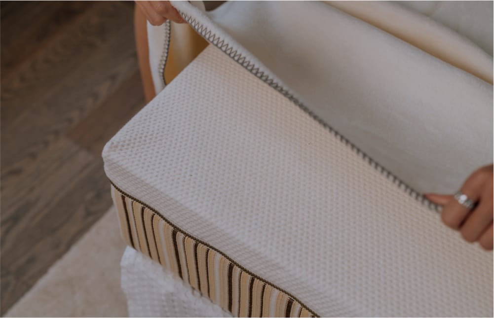
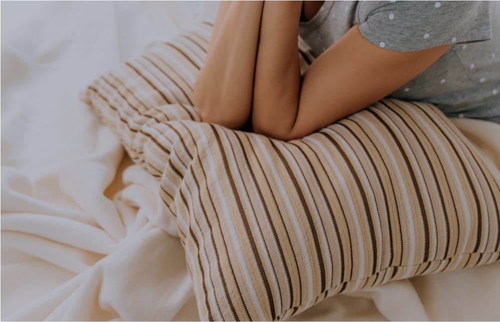
Beyond choosing the right colors, creating a cozy and inviting environment can significantly improve sleep quality. Investing in high-quality, durable products like comfortable mattresses and pillows can enhance the overall comfort of your sleep space.
At Essentia, we offer a range of products designed to optimize your sleeping experience, from our Comfort pillow to the Stratami and Tatami mattresses. Combining a soothing color palette with these premium sleep products will help you create the ultimate sanctuary for restful sleep.
The colors you choose for your bedroom can make a significant difference in how well you sleep. By paying attention to both your decor and your sleep environment, you can create the perfect setting for restful and rejuvenating sleep.